Jones wrote:
avwolf wrote:
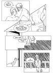
My inital impulse with the kid is a 14 year-old girl
It's a boy, and he's supposed to be about seven. XD I just suck at drawing kids. -_-' But that's why he's there; for practice! And his dad won't let him get his hair cut until he wants to. And he doesn't want to. And he wears a hat because he has pointy ears, and his mom doesn't like him having pointy ears, so she makes him cover them. 8D
Ah, fair enough. I did say I was a poor judge. Giving something to compare his height to more concrete than the railing, which we've never seen in comparison to one of the other characters would help in judging the age. Besides, that one panel isn't much to go on, so don't be too hard on yourself. The next frame ought to clear all of that up: this is the sort of frame that leaves the audience going "Who is this?!" A child of sufficient youth is going to be a tough call without the comic's support no matter what.
Jones wrote:
avwolf wrote:
He's missing the fingers on his hand, which, combined with the angle the hand is at, makes it hard to tell if his hand's on backwards or not. :P
Assuming you're referring to the hand pulling up the pants (out of context, I'm sure that sounds REALLY weird), he does have fingers, they just got lost in the shading... -_-' Note to self: Take into consideration lines and make sure that shading is not going in same direction. :D
Yes, that's the hand. Alternatively, you could make the lineart differentiating the fingers darker than the shading (but lighter than the outlines).
Jones wrote:
What's a CMS.....? >_>'
Content Management System. I'm assuming that the whole thing isn't hardcoded in its entirety and you're not having to add everything by hand.
Jones wrote:
And I don't quite udnerstand what you mean by "the content starts a little too far to the right"... Maybe we're just seeing them differently? I mean, I'm using IE7 as well, but maybe our screens are just different. Mine's not a widescreen, though. (1024x768)
More like a difference of personal preference. You've got a good fifty or so pixels between the side of the horizontal rule and "<< First Comic" link, and the border between black and white. That space seems wasted to me, especially as the content bleeds out of the white area to the far right side of the page.
Jones wrote:
In regards to the newest page being too big: I SWORE I resized it, but I didn't... And since the original file's on a different computer, I have to go all the way over there to fix it, and I jsut haven't gotten the chance... -_-' And, at least from what I can see, that's the only thing that goes off the white into the black.
It's not really the page itself as it is that particular link. Like I said, you're letting the formatting decide how wide it gets to be. It's being greedy and taking up as much space as it can. You have to tell it that it's only allowed to be so wide, or it'll try to be as wide as the remainder of the window. This causes the links, and eventually the comic itself, to start to move onto the dark part of the background to the right if the screen is wide enough. (Hint: Use widths in pixels as much as possible. Percentages are unreliable for measurement.)
Code:
<table border="0" width="80%" cellpadding="0" cellspacing="0" align="center">
That line's the one giving you the trouble. The 80% measurement means that it's dependent on my browser window size. It cannot shrink to be smaller than the image width, or it'd try to do that for smaller windows. It'd be safer/better to replace that with something like this:
Code:
<table border="0" cellpadding="0" cellspacing="0" style="width: 525">
Which isn't great CSS, but it'll force the table to be with width of the comic image. You might want to pull the comic image itself into the table, which would save you the trouble of having two tables with exactly the same setup for the top and bottom navigation bars, as well as forcing the navigation bars and the comic into a predictable alignment.
-- Hrm --
I see you removed the Top navigation bar and made the comic a link to...the most recent? (With only two comics, I can't more than guess. :P) But the bottom navigation bar still bleeds over. See my notes above. Your table width is what's causing the difference in the way you and I see the comic.