Ok, so there seem to be a lot of sig noobs around here (no offense, even I'm a sig noob... well to NSL that is). Here's some tips.
- Flow. Flow is important, if it doesn't flow then it sorta sucks. Look at the way it "FLOWS".
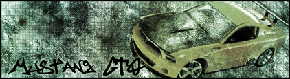
examples of sigs with flow (not made by me, these are pwnage compared to mine):

 - Depth. Hard to explain so I'll steal this depth tut off of one of my old GE members.
 - Blending. Make sure when you make a sig, don't change the colour of the stock to match the bg, but rather have the bg match the stock. You can mod the stock, but make sure you don't over do it.
examples:

 - Also make sure the colour isn't monotonous. Monotone = basically only one shade of colour.
Monotone:
 No Monotone:

I might add more... not sure if I'm missing anything or not.
----------------------------
Now how to make it better.
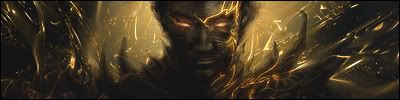
- Try and make it flow like this. See how it looks like everything is coming away from him. That's because it's flowing away if you catch my drift.

- Need more depth. Hard to do, hell I have trouble doing it, but it can be done. All you need to do is make it look like the stock is in the foreground, have a somewhat middle ground and a background. This is easier to do with a photomanip such as this:

- Blending. Basically make the stock blend into the bg. This is easier done with an abstract background. As you can see, the stock for this sig and the colours of the background blend into each other almost perfectly. That is blending.
- Never use more than one stock. Makes it seem cluttered. If you have been looking at the examples so far, you can see that they contain only one stock and have backgrounds to accompanie them. Only time you use more than one is when you are doing a photomanip.
- Photomanip. Basically take 2 stocks/photos and manipulate them together so it seems as if they are one. If you look at this tag, you'll see that C4, the one who made this, used a BoA stock and a city stock and made them go together well. BoA was put in the foreground while the city was in the background.

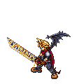
- This sig here has both depth, flow and blending. If you look closely, you'll see that the sprite's colours go well with the tag colour. In terms of depth, the sprite is actually in the middle ground. The smudging is the foreground, sprite is the middleground and the light source behind him is the background.

- Have a lightsource. If you've ever drawn something, you'll know that to make it look nice, you shade it. And to shade it, you need a light source. Basically you do the same thing, but no shading is required. Not expected of you to do it now because it is quite hard to know how to use it.
Hope this helped xD
PS - rip ANY of these sigs and you're dead.
PSS - Added more so yea >>; Just for more clarification.
Terminology that I learned (Don't bash me on this Sage >>;)
Stock - Basically the main picture you use. Usually it's a picture of an object, person, character (2D image).
Render - 3D models created in a 3D modeling program.
E.g.

That's basically it atm >>; I'm still trying to remember more D: