Narane wrote:
avwolf wrote:
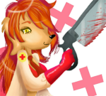
A few of the highlights on the right side of her head (left side of the picture) seem inconsistent with the rest of the lighting direction to me
Well, the lower jaw could have used a little more darkening, but I think that's about it there.
Ah, I wasn't precise. I was actually referring to some of the highlighting on her hair on that side of her head, actually. It picks up a couple places of highlight that seem somewhat inconsistent with the rest of the lighting, and parts of it don't seem shaded enough, but I have no ability in maintaining sourced lighting conditions, so I might be totally off the mark.
Narane wrote:
avwolf wrote:
I might suggest adding another shade between the pink and the purple too.
Hmm? The pink came out as a result of brightening the purple (effect of a little Color Dodge + Overlay). I don't know what colour I could fit in between without disrupting the smooth gradient. :?
Ah! Okay. Then maybe another layer at the border where either the dodge or the overlay isn't as intense? Maybe? There's nothing wrong with it as-is, really, it's just very eye-catching. That might be your intent, or it might simply be the way things work; I know just enough about Photoshop to understand what you said, but not enough to know how to apply it any better than you have here.
GD wrote:
collar looks like skin flap
Either that or the collar of a mock turtleneck, which was my first impulse. But since she's obviously not wearing a shirt in the picture, it's clearly not that.
She does really look fantastic, Narane.